Identifying Similar Airline Customers with K-Means Clustering
- The objective of this exercise is to analyze airline customer data using K-Means to identify similar customer groups. The coding exercise is provided in the python jupyter notebook below.
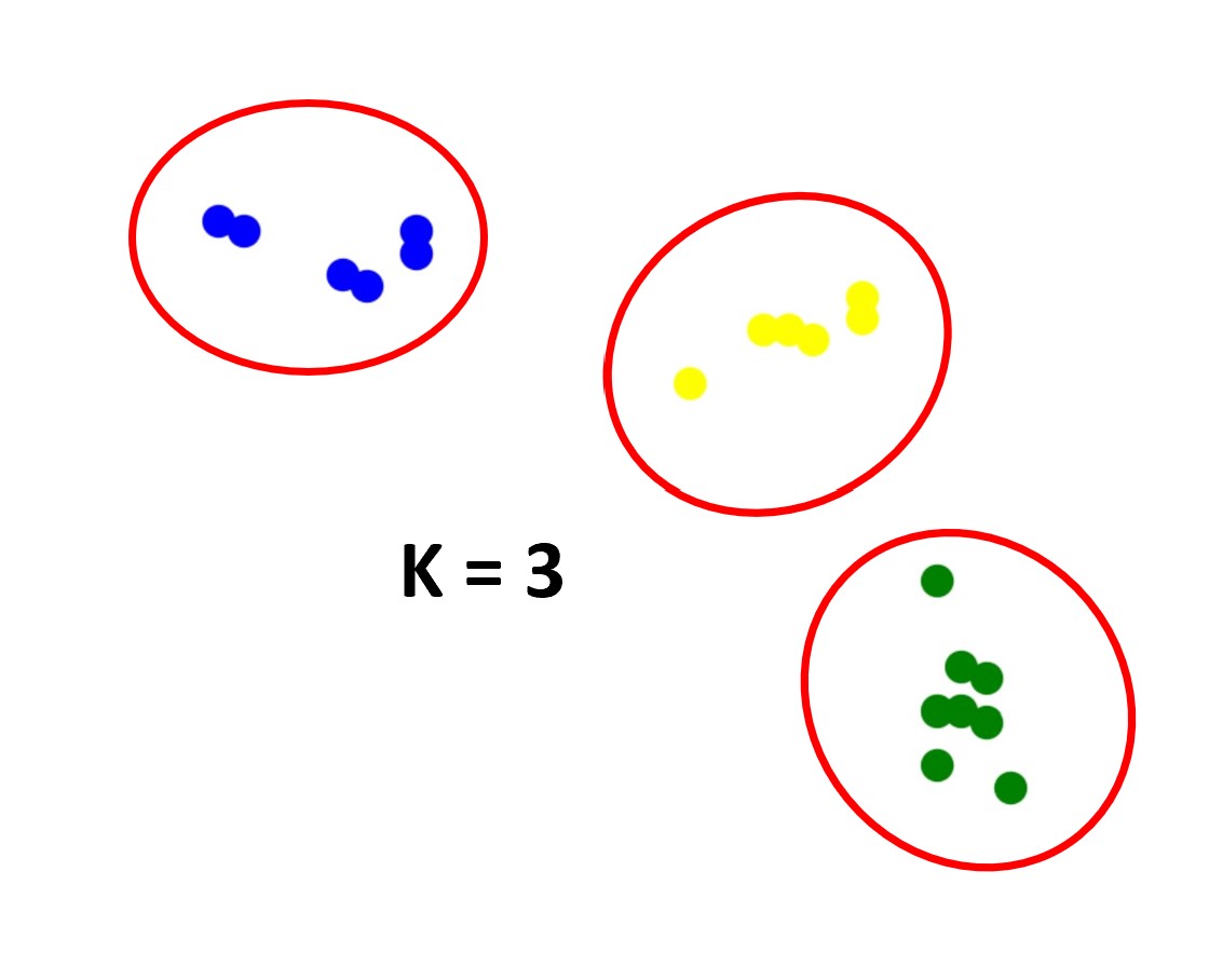
- K-means is a popular unsupervised learning clustering algorithm that identifies similar data points into groups or clusters. K-means can be used for a wide variety data such as identifying similar customers, anomaly and fraud detection, image processing, text processing, and many other valuable applications. The K-means algorithm identifies the centroid (arithmetic mean) of all points within the same cluster. The K-means algorithm will assign every point to its closest cluster center (centroid) each iteration. The algorithm will continue to repeat this process until there is a minimum change of the cluster centers. More information can be found here for Scikit-Learn K-Means and here for a general overview of the K-Means algorithm.
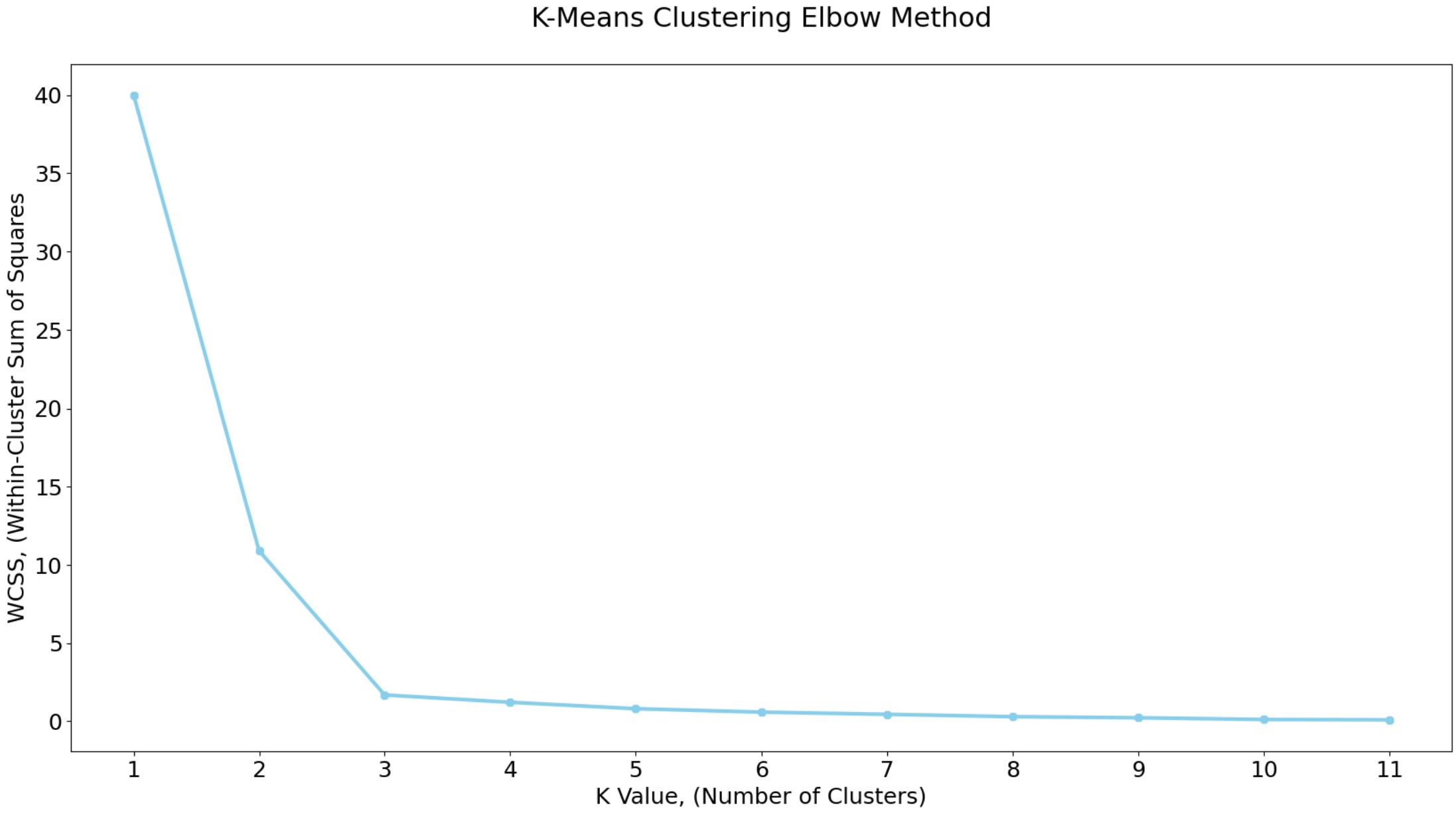
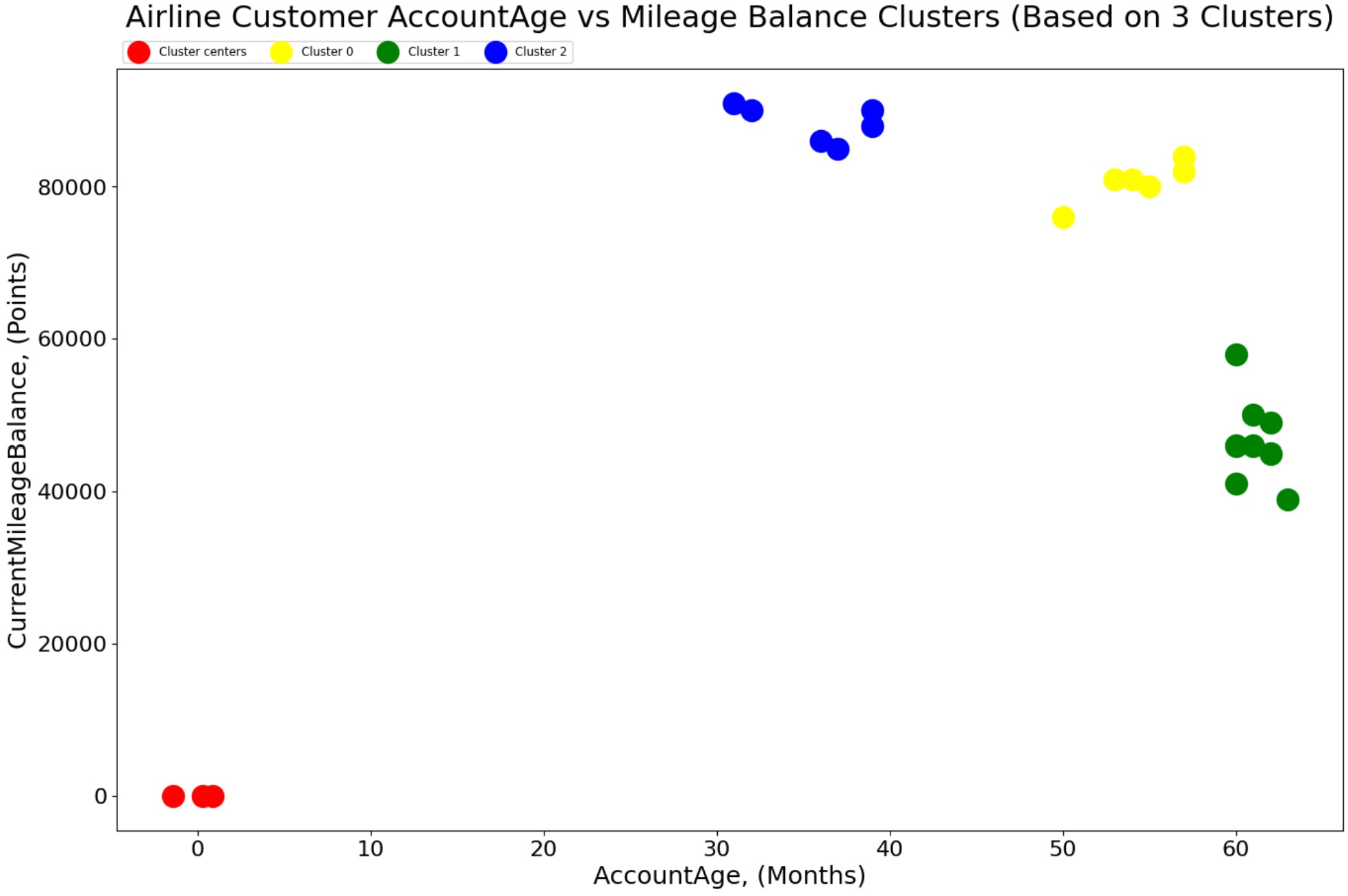
- The K-Means clustering elbow method graph (number of clusters versus WCSS) shows there is a noticable bend (elbow) in the curve at approximately 3 clusters. The within-cluster sum of squares (WCSS), also known as inertia is calculated for each k value and appended to the wcss list. WCSS measures how compact clusters are, where lower wcss values indicate tighter clusters. The final graph shows the three clusters for Airline Customer AccountAge vs Mileage Balance.
- Tables and graphs can be found here: Identifying Similar Airline Customers with K-Means Clustering Python Jupyter Notebook